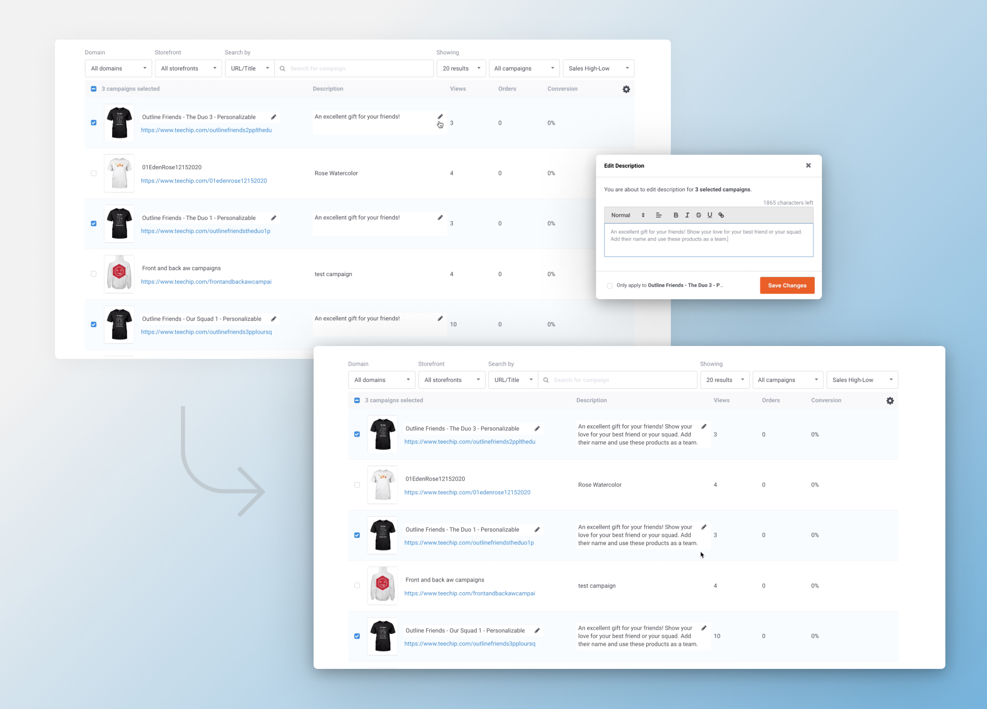
Campaign List View
Project Summary
Product Designer
TeamsProduct manager, Engineering team, Seller support team
ResponsibilitiesInteraction design, Information architecture, User flow, UI design, Prototype, User testing, Quality assurance
Dec 2019 - Feb 2020
ClientScalable Inc
ToolsSketch, Invision, Fullstory
About Chip
Chip is an e-commerce platform specializing in print-on-demand products that offer packing, shipping, and customer services for entrepreneurs. Merchants can create a store where they can market and sell customized products with their designs.
Problems
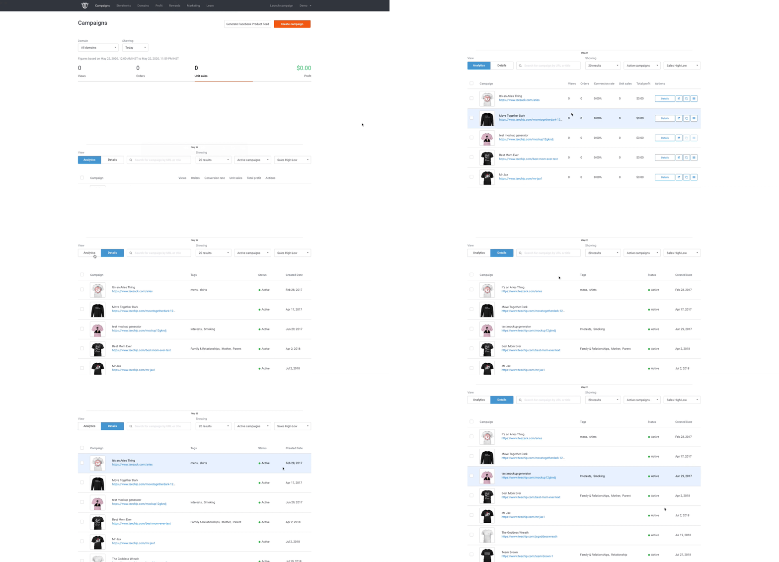
Sellers reported frustration with being unable to bulk edit and view information they needed on the campaign page, resulting in sellers moving to other platforms.
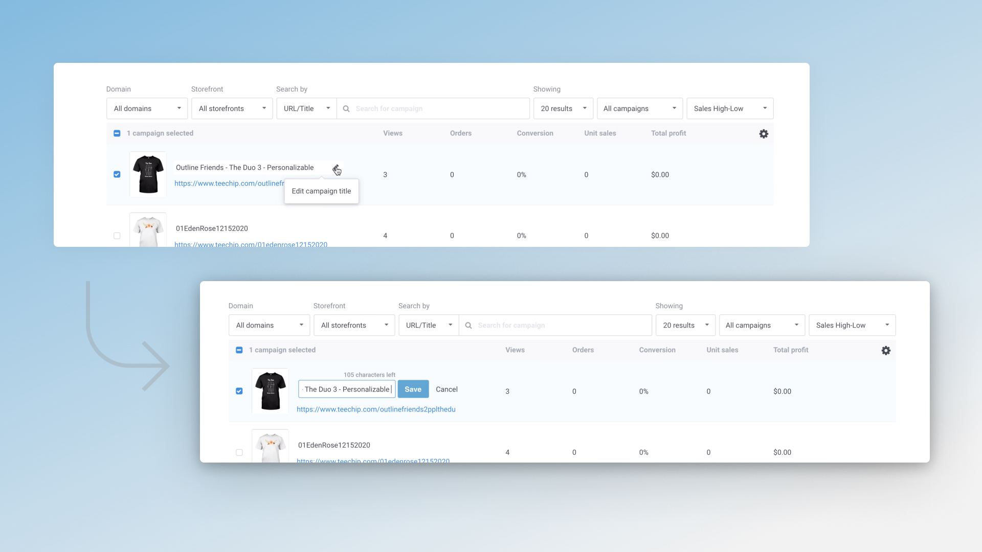
1. Difficulty updating campaign information, such as product descriptions or Facebook Pixel IDs
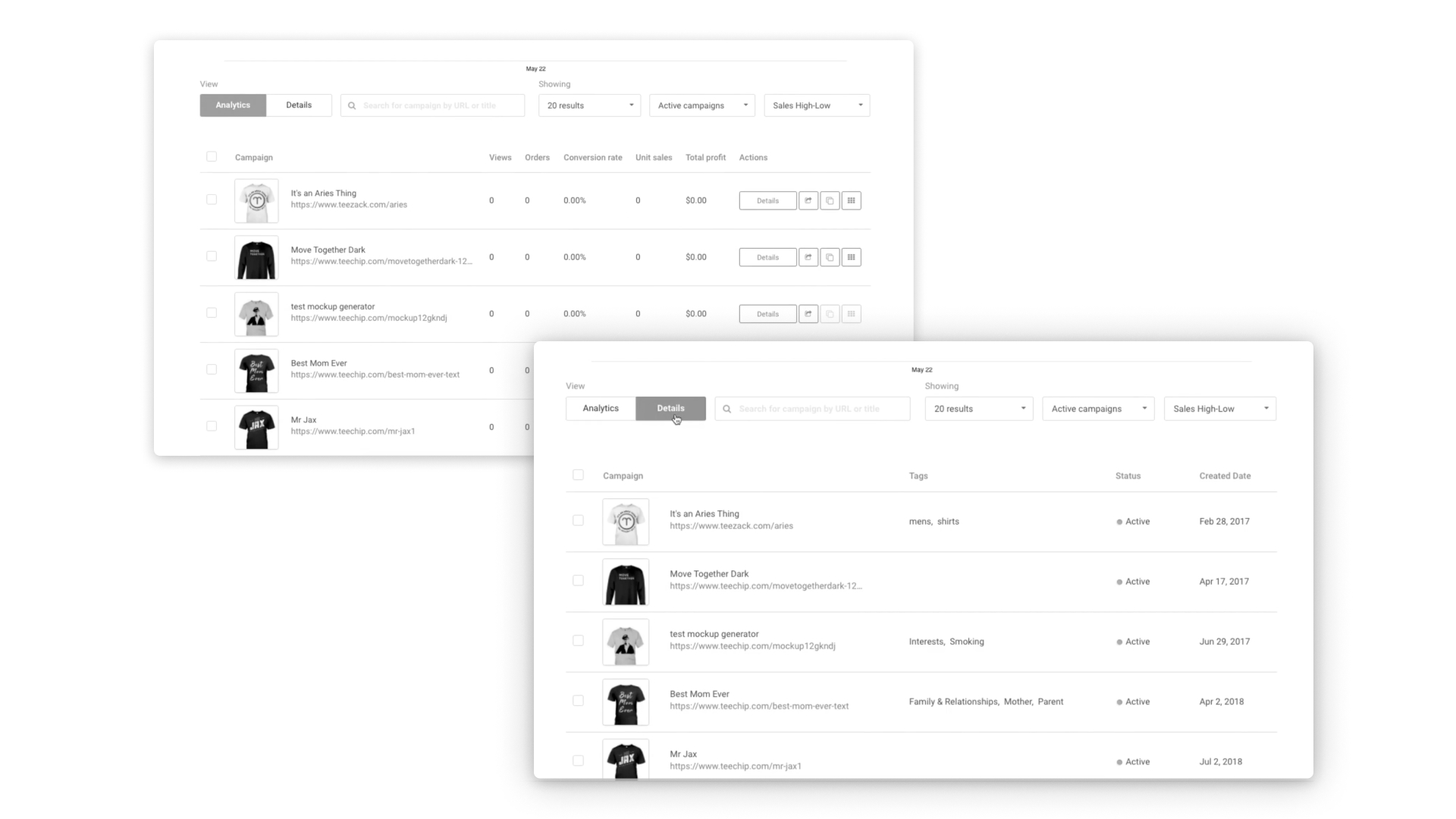
2. Information visible on the main seller dashboard is scattered, making it difficult to find or manage
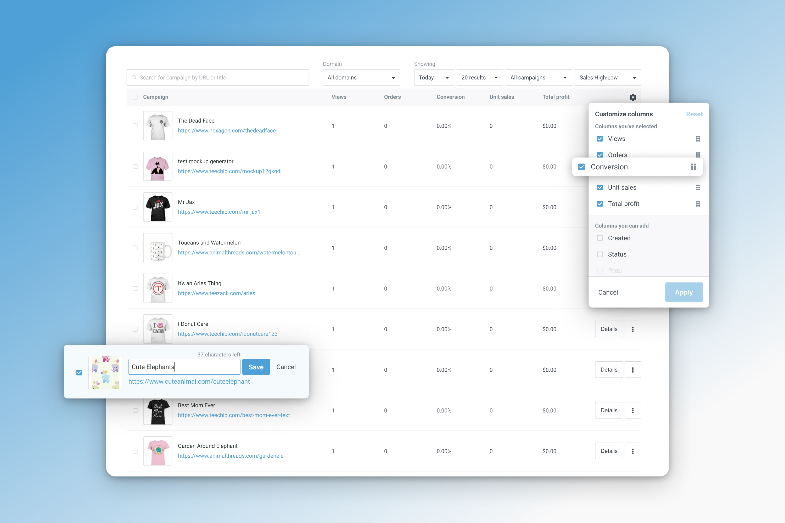
3. No way for merchant team members to customize views according to their role responsibilities, such as marketing or graphic design. These issues were cited by the seller support team as reasons sellers move to other platforms.
Goals
1. Improve overall merchant satisfaction on Chip platform.
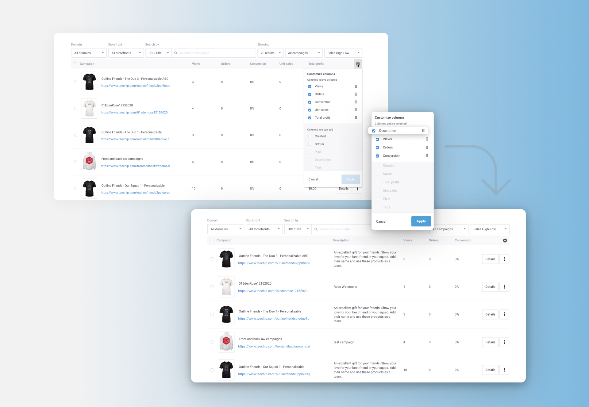
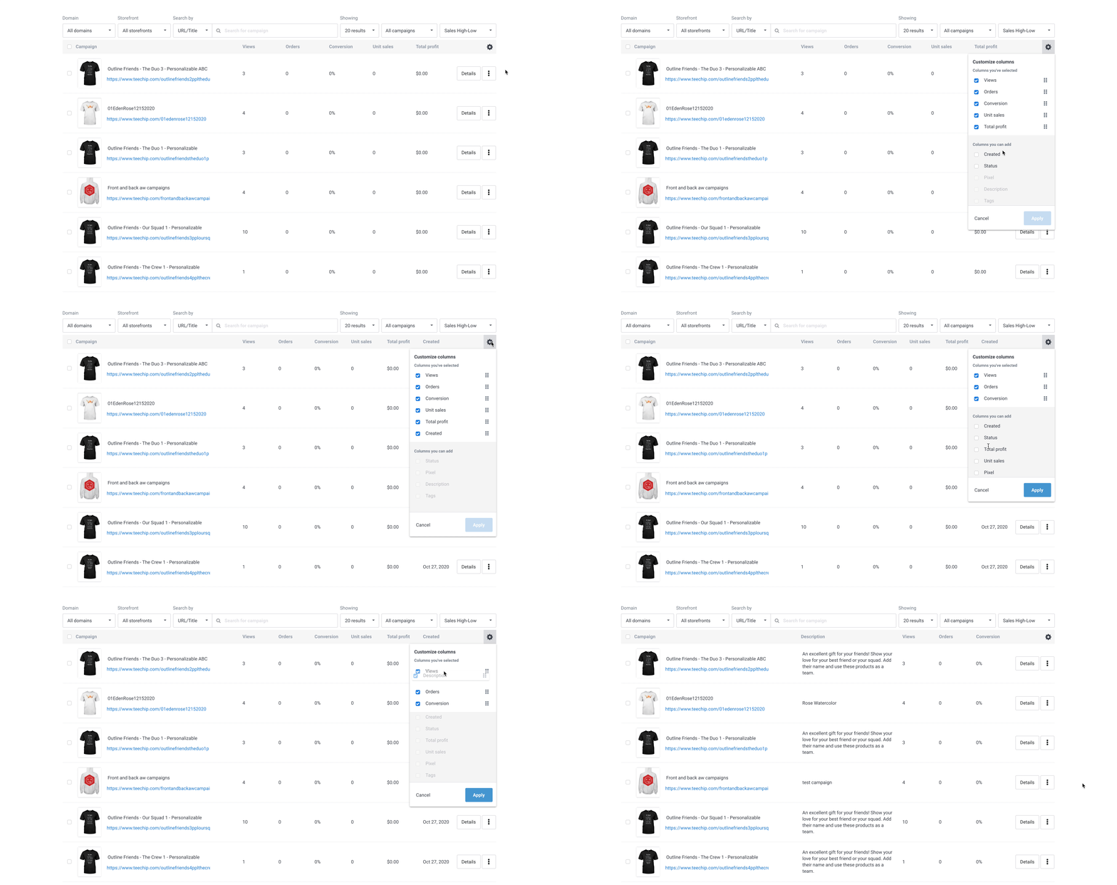
2. Allow users to customize their campaign list view based on the information they need for their role.
3. Enable merchants to complete tasks like updating campaigns faster through bulk editing.
Process

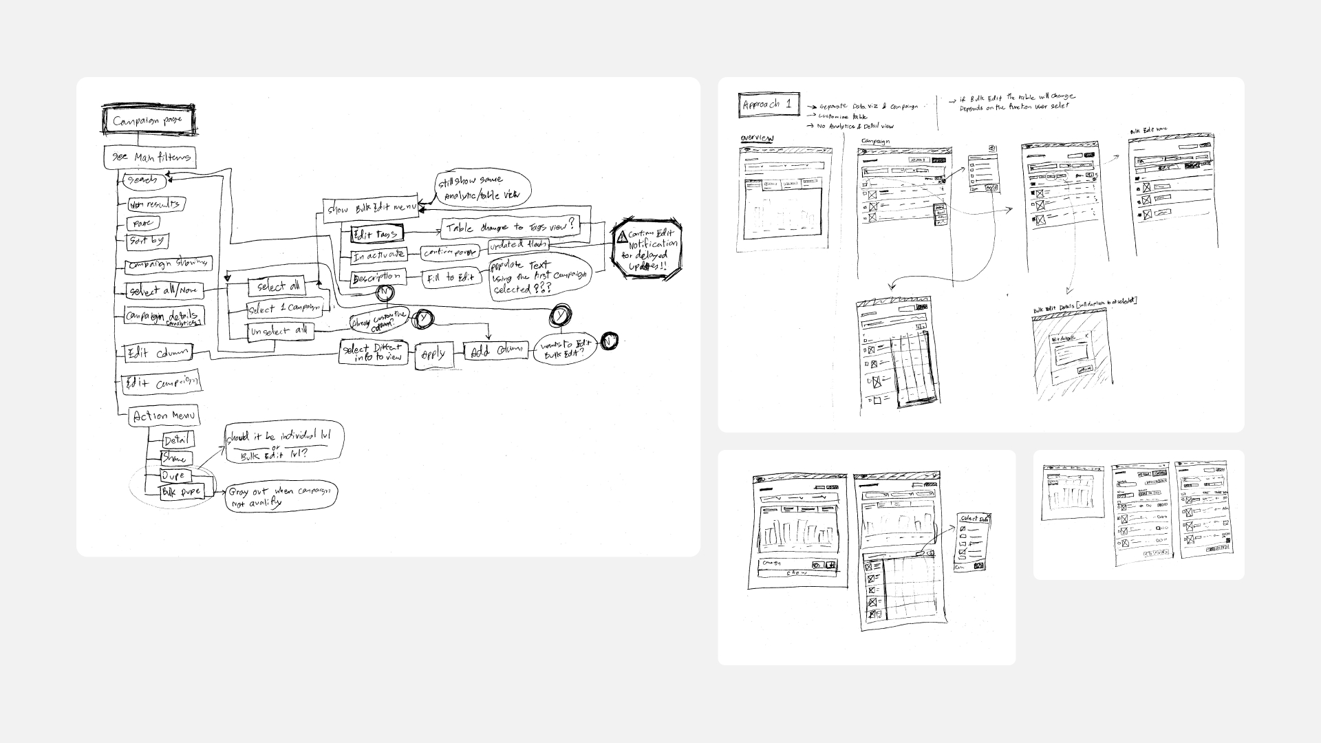
Kick-off
Iterations
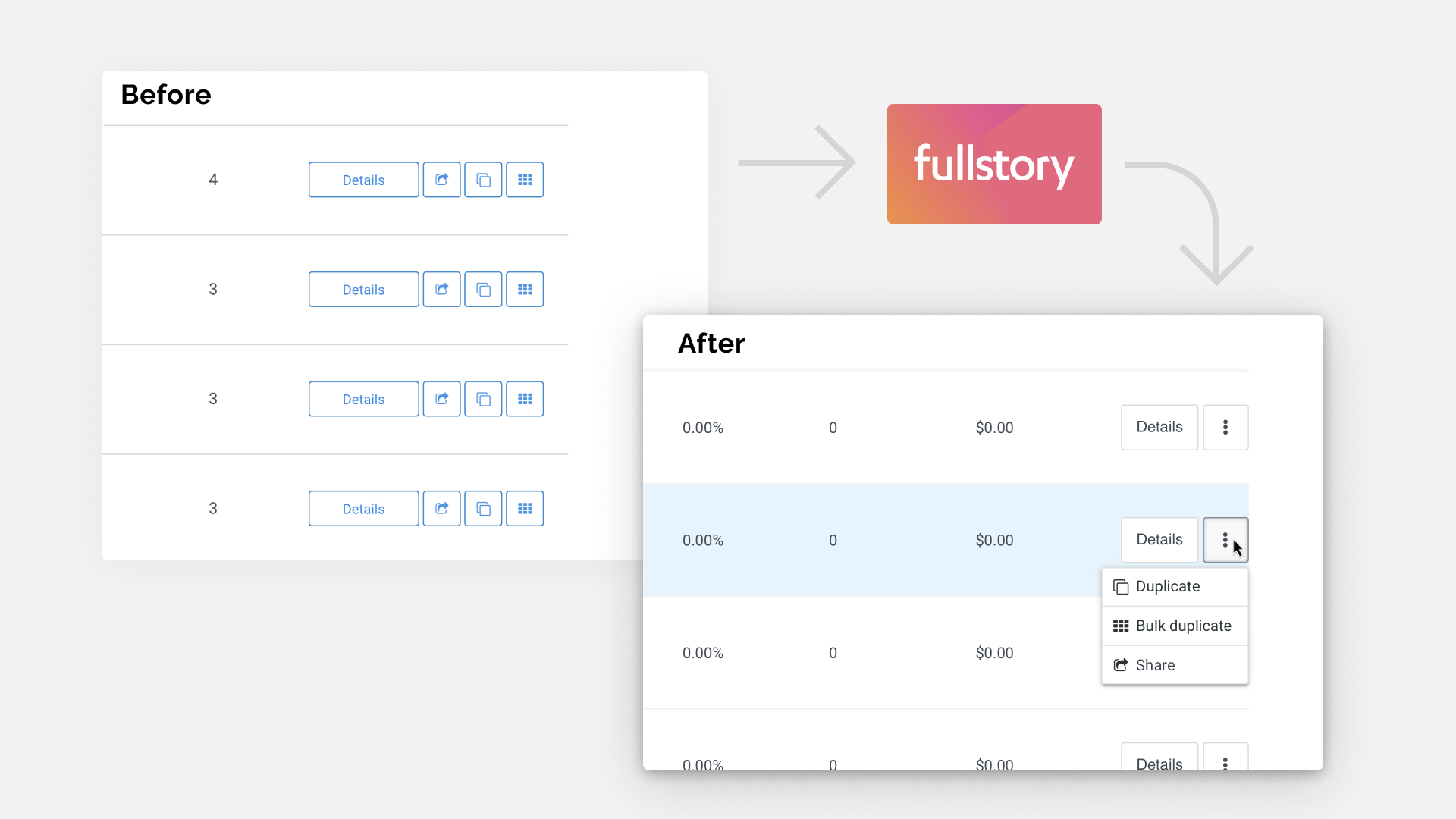
We needed to display more information without overwhelming our users. After talking to developers, we decided to break the original grid and expand the table. I researched how our merchants interact with the page using Fullstory, then decided to consolidate other buttons into a dropdown and re-order by the popularity of use. I created high fidelity prototypes during this phase and explored UI solutions.
Usability testing
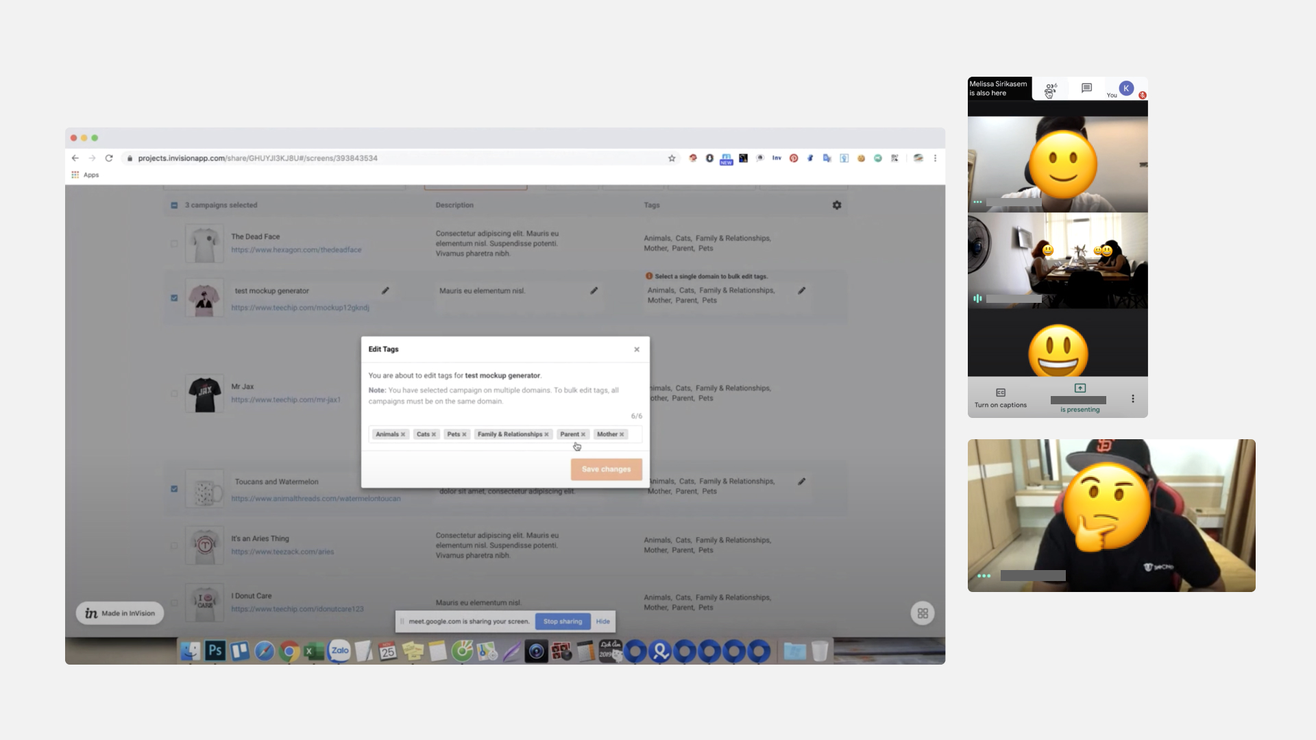
To ensure that our solution for the assumptions we made were correct, I partnered with the seller support team to conduct usability testing with high-performance merchants. This let us identify problems and correct them before we handed off the design to developers.
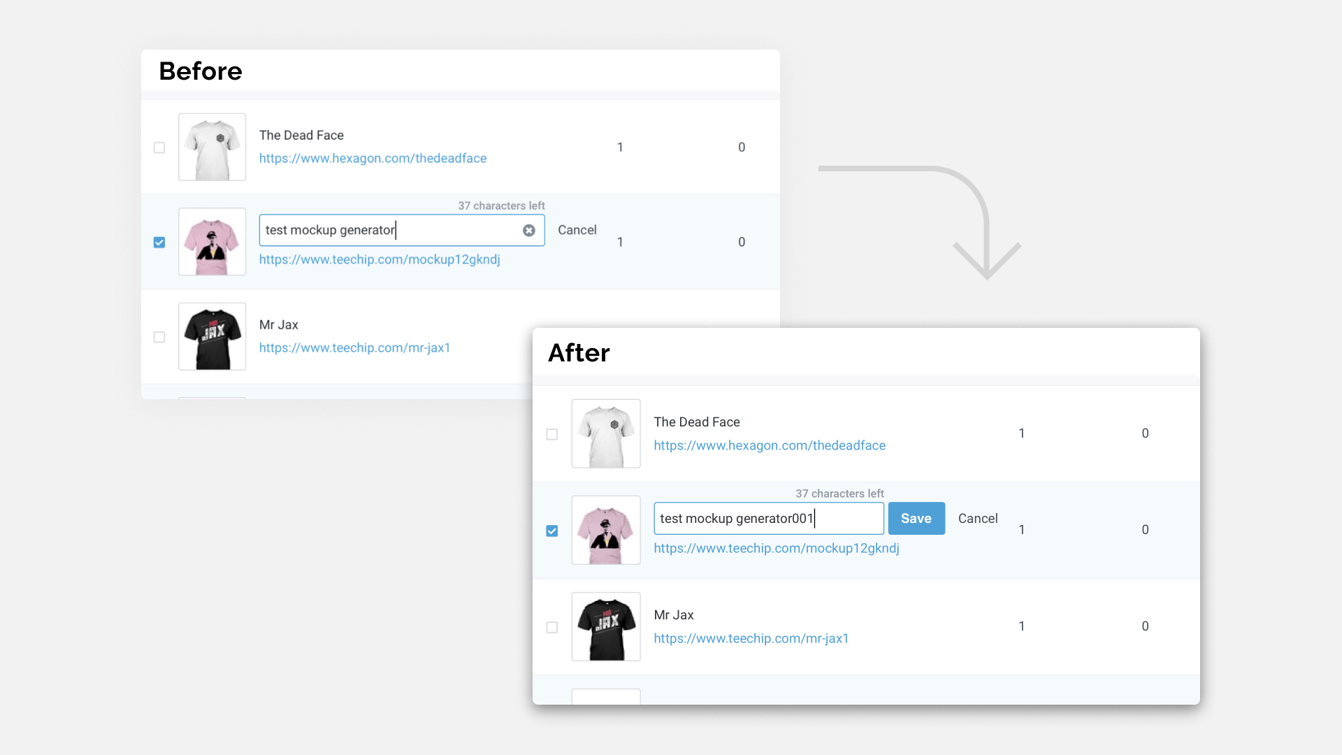
Implementation
I created the guidelines for front-end engineers to follow. I also worked with quality assurance engineers to ensure all the interactions and UI were correct and working as expected before launch.
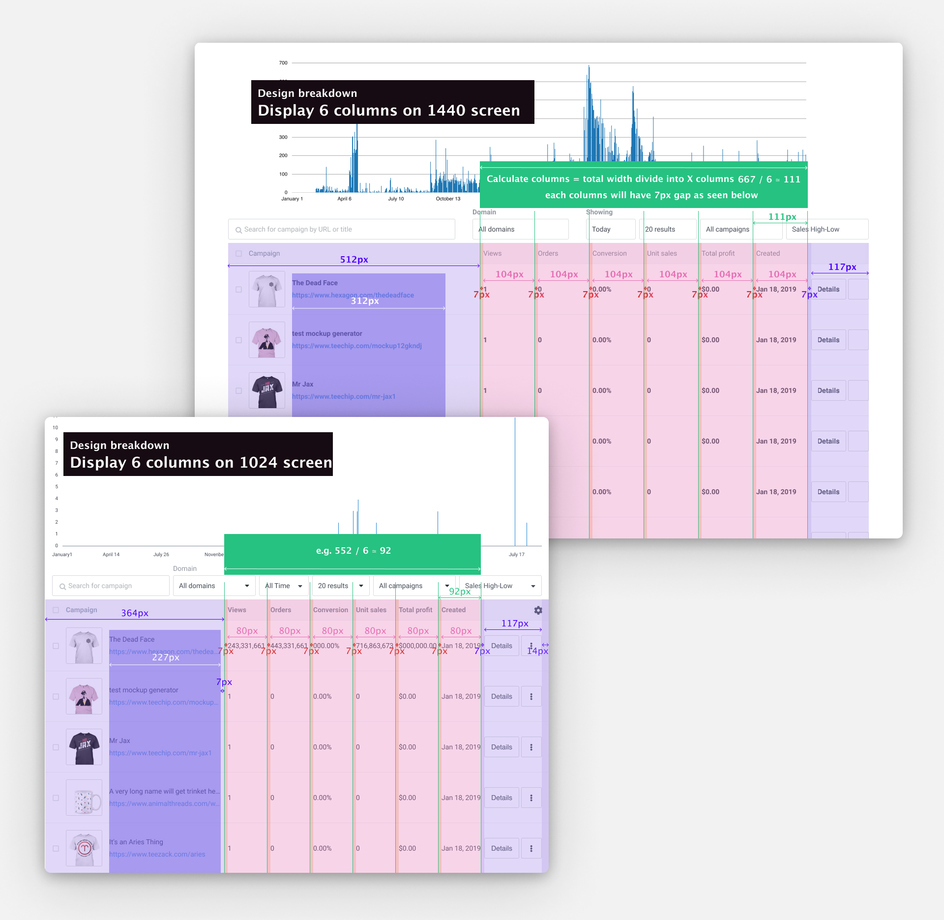
Results
Out of 45 users surveyed, 39% were satisfied, giving it a rating of 4+ out of 5.
We did user testing with a group of high-performance sellers throughout development for continuous feedback to adjust the product according to merchant needs. This enabled early validation of bulk edits & customizable views as high-value initiatives.
We followed up with a user survey after launching these features. Out of 45 users surveyed, 39% were satisfied, giving it a rating of 4+ out of 5. The average rating for the seller dashboard was 2.9/5, however the features added in this case study outperformed the average. The customizable dashboard feature was rated at 3.1/5, and the bulk edit feature was rated at 3.5/5.
