Personalized Text
Project Summary
Product Designer
TeamsProduct manager, Data team, Engineering team, Seller support team
ResponsibilitiesInteraction design, Information architecture, Competitive research, User flow, UI design, Prototype, User testing, Quality assurance
May 2020 - Oct 2020
ClientScalable Inc
ToolsFigma
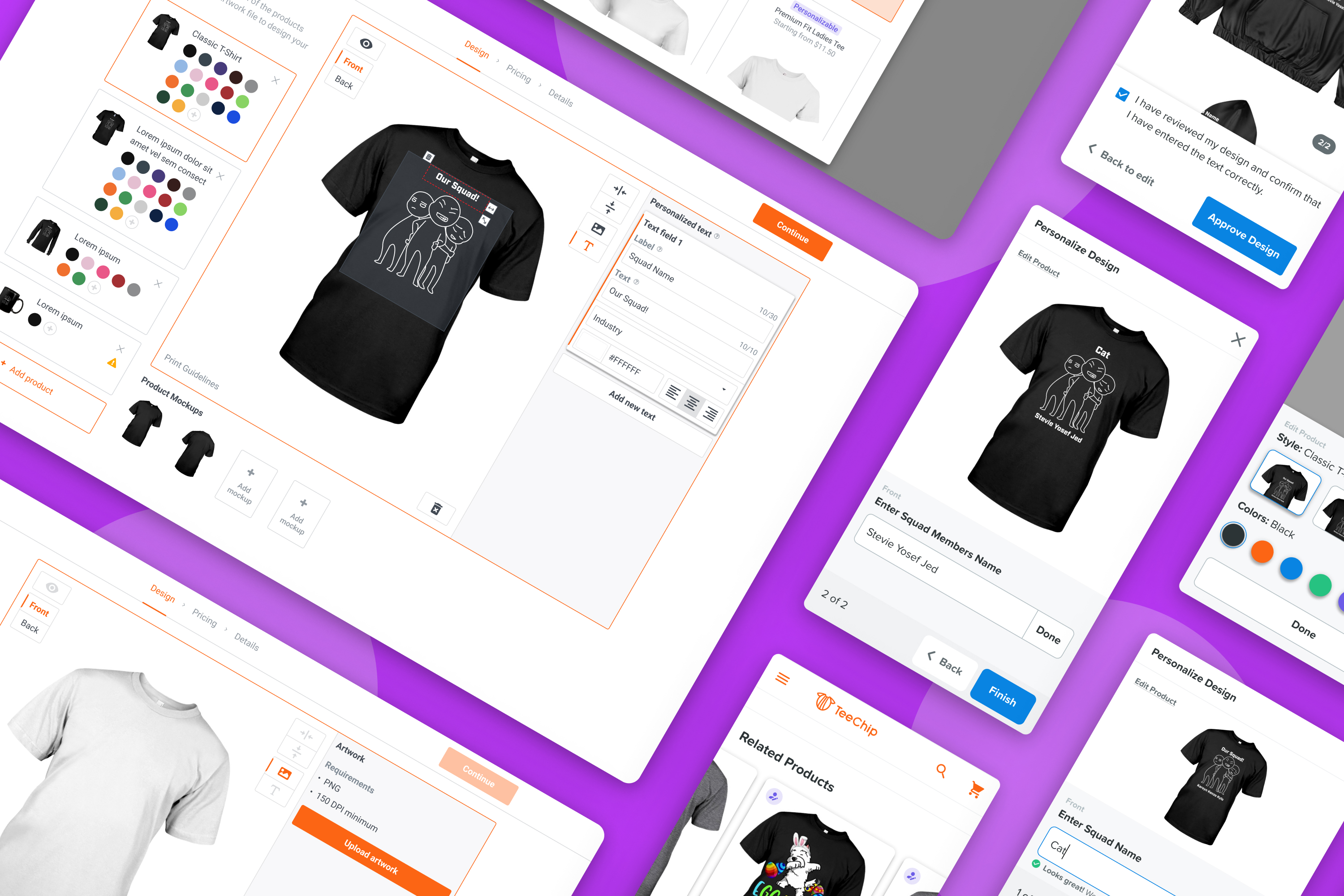
About the products
Chip is an e-commerce platform specializing in print-on-demand products that offer packing, shipping, and customer services for entrepreneurs. Merchants can create a store where they can market and sell customized products with their designs.
TeeChip is the marketplace for Chip sell-side to list their products. This is where we serve our buy-side consumers.
Problems
Scalable was losing sellers to competitors for not providing product customization on Chip, an eCommerce platform.
Product customization is a rapidly rising trend in the print-on-demand market. Consumers value items that can convey individuality for the person who bought or received them as a gift. Our merchants requested the ability to create personalizable products. We were seeing a pattern of sellers leaving our platform because we didn't offer customization.
Goals
Business
1. Increase seller acquisition
2. Decrease seller churn from missing features
3. Increase sales conversion
4. Launch before 2020 holiday season
Customer
1. Merchants: the ability to offer personalizable products to their customers
2. Buyers: the ability to purchase products customized for themselves or as gifts for their loved ones
Scope
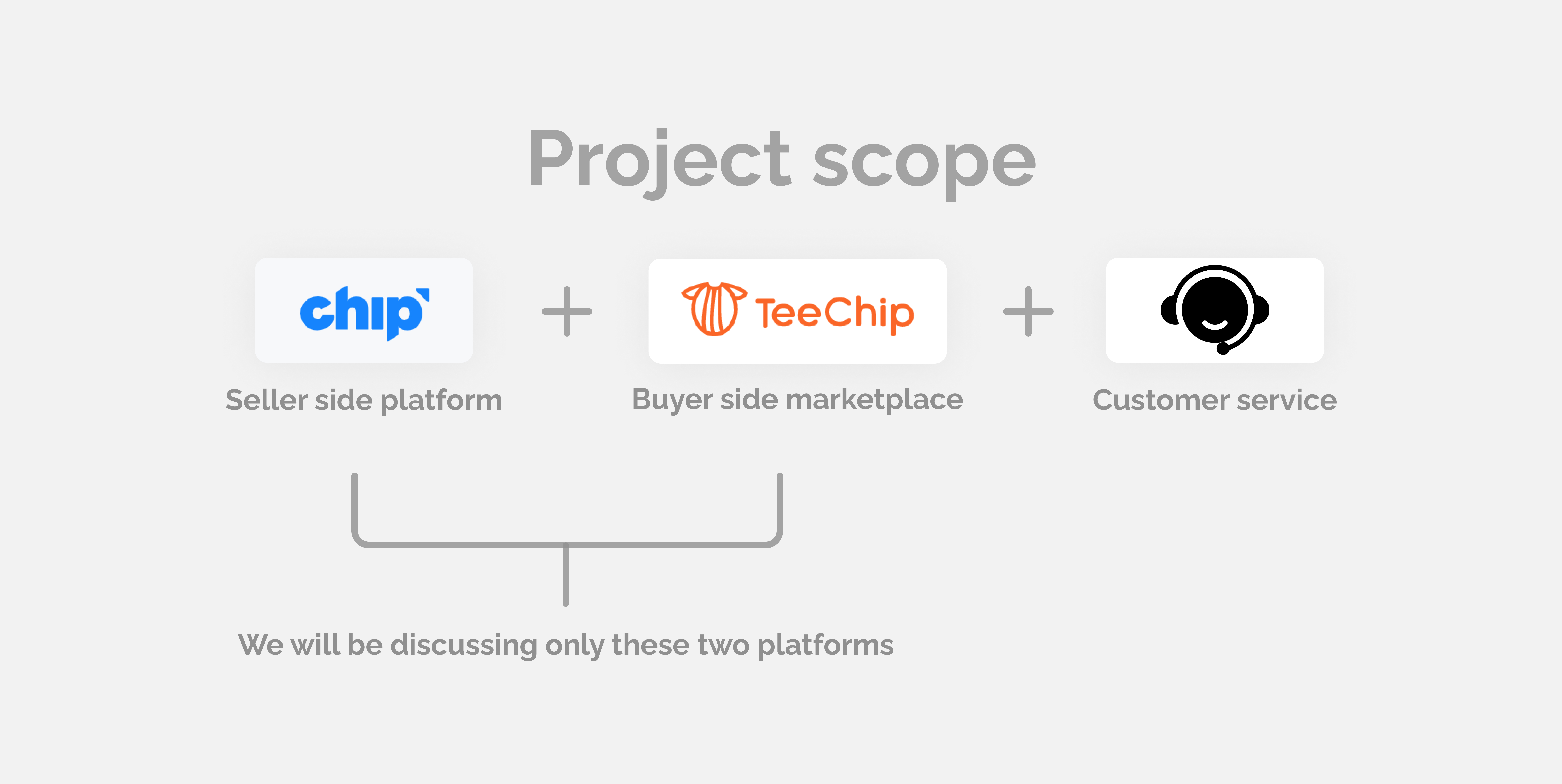
Personalized text project involved three different platforms: seller-side platform, buyer-side marketplace, and customer service platform. To make this case study more concise, we will focus on the seller-side platform and buyer-side marketplace.
Process

Kick-off
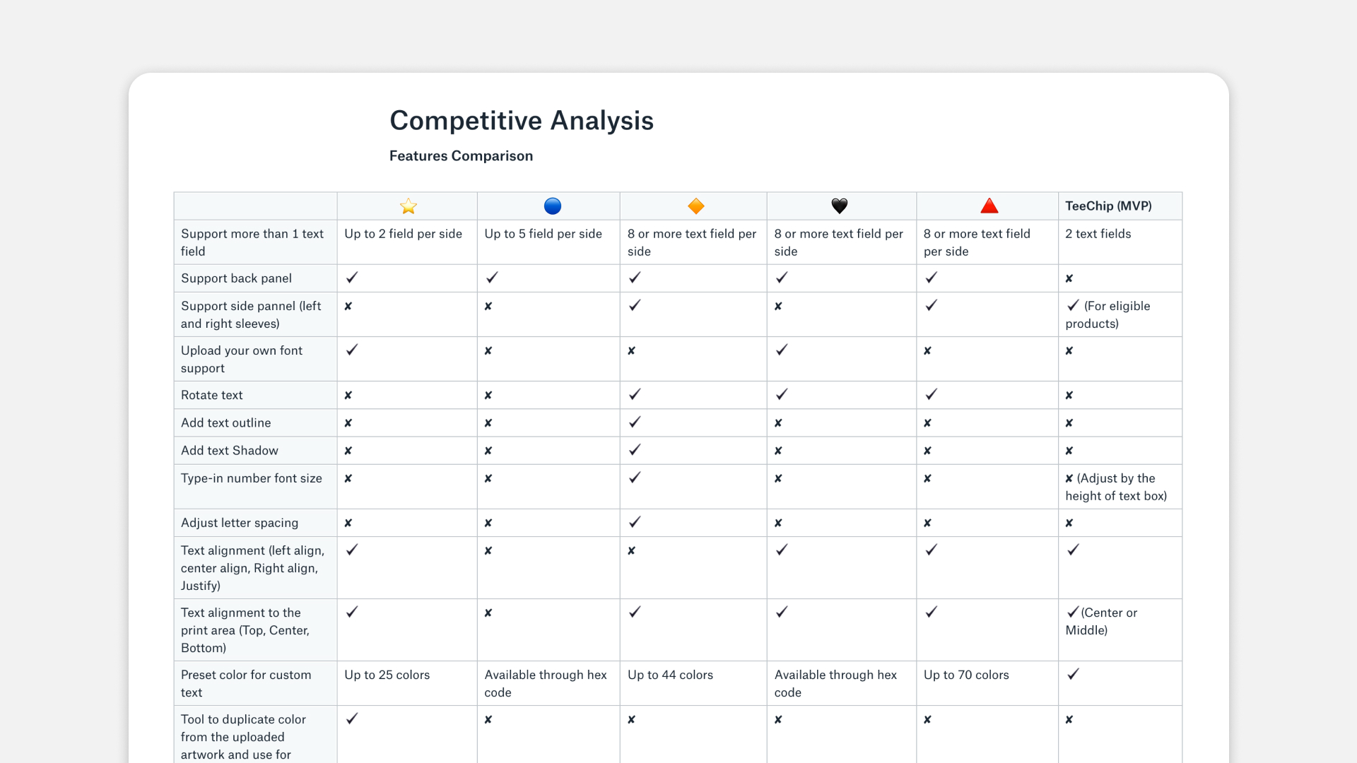
Customizable text for print-on-demand products was the most requested feature at this time, based on customer feedback. The data team also conducted market research to validate the revenue potential. Afterward, I started this project by conducting a competitive analysis to help the team prioritize which functionality we should offer in each phase.
Iterations
Sell-side
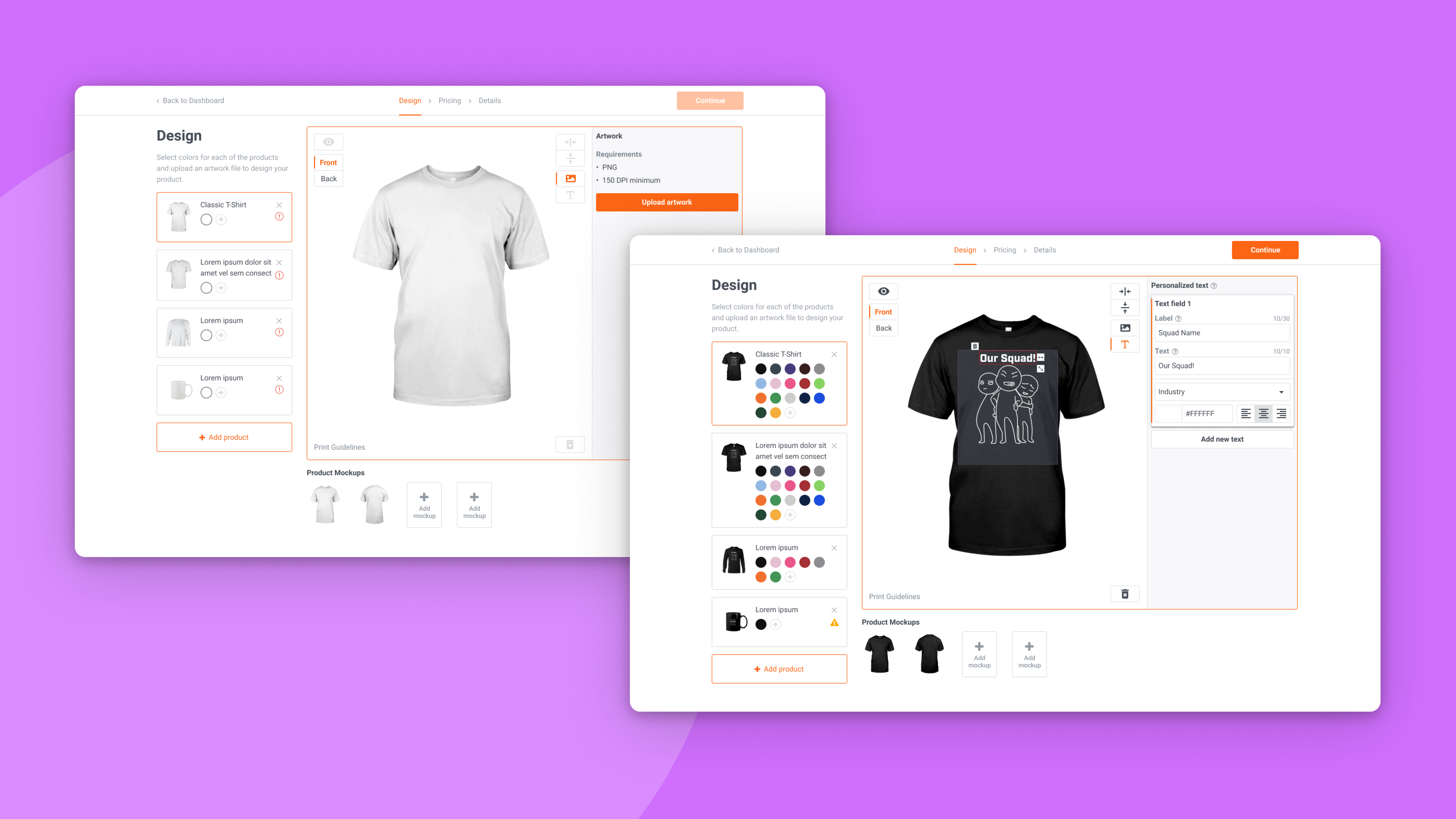
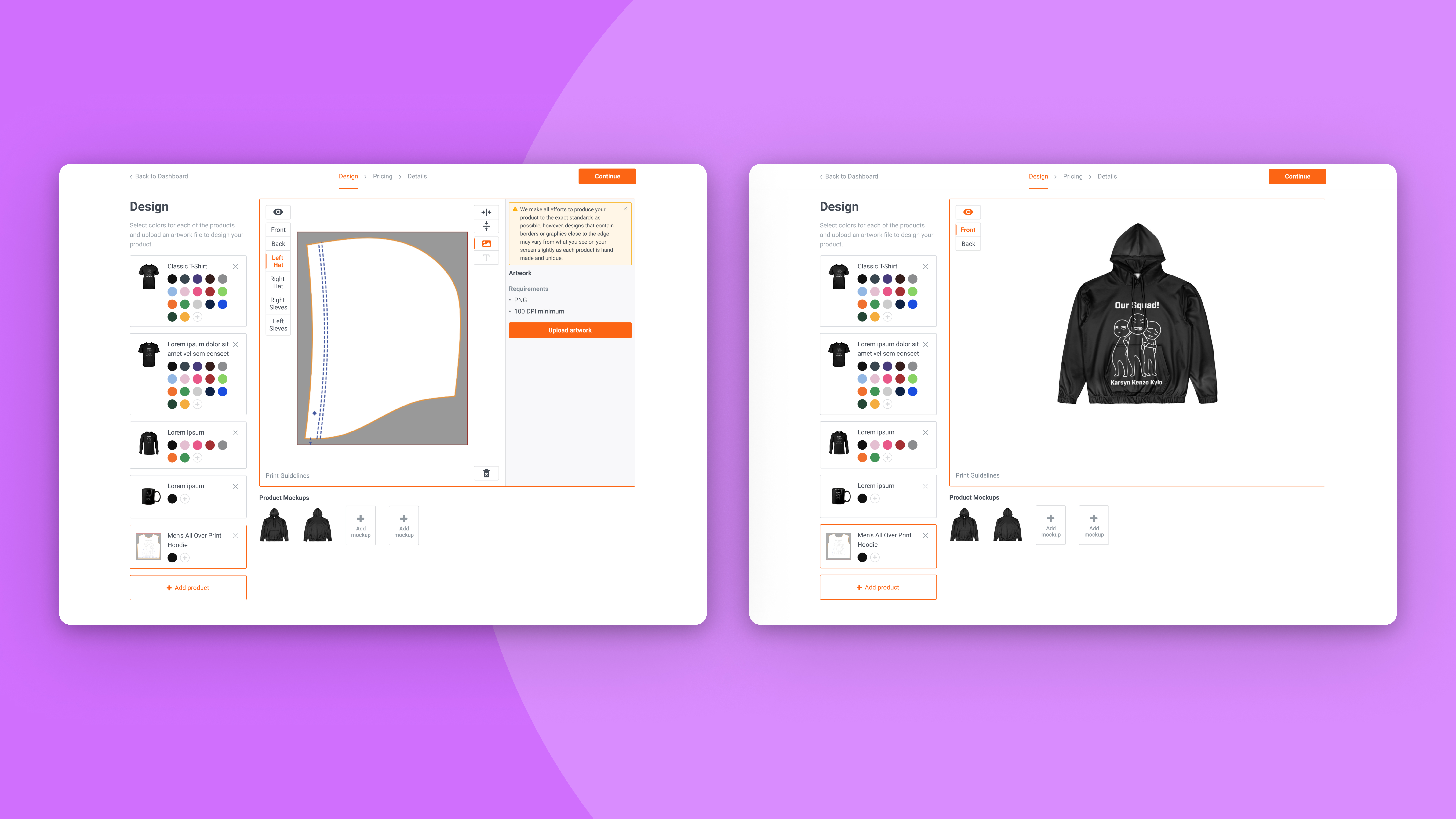
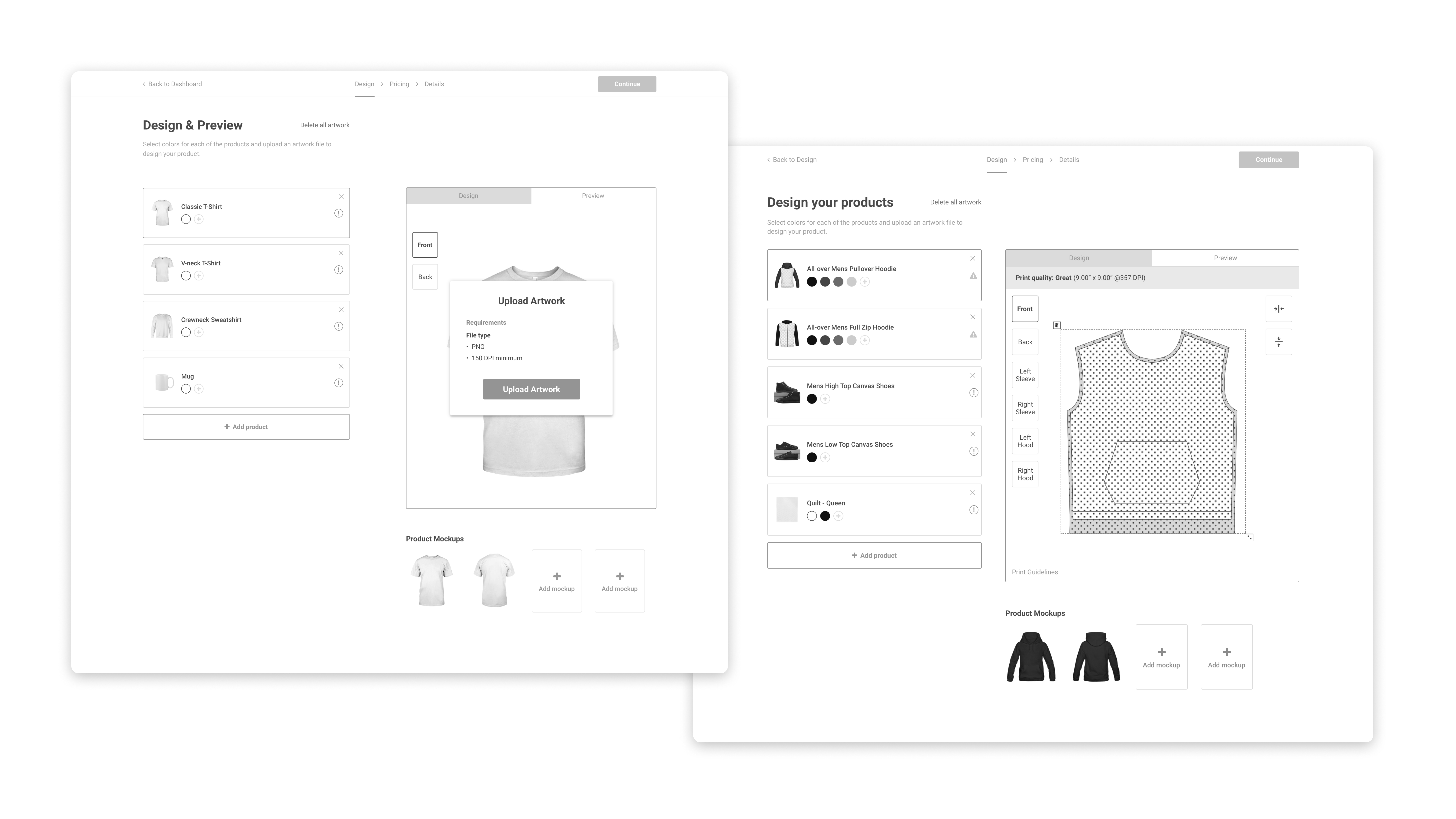
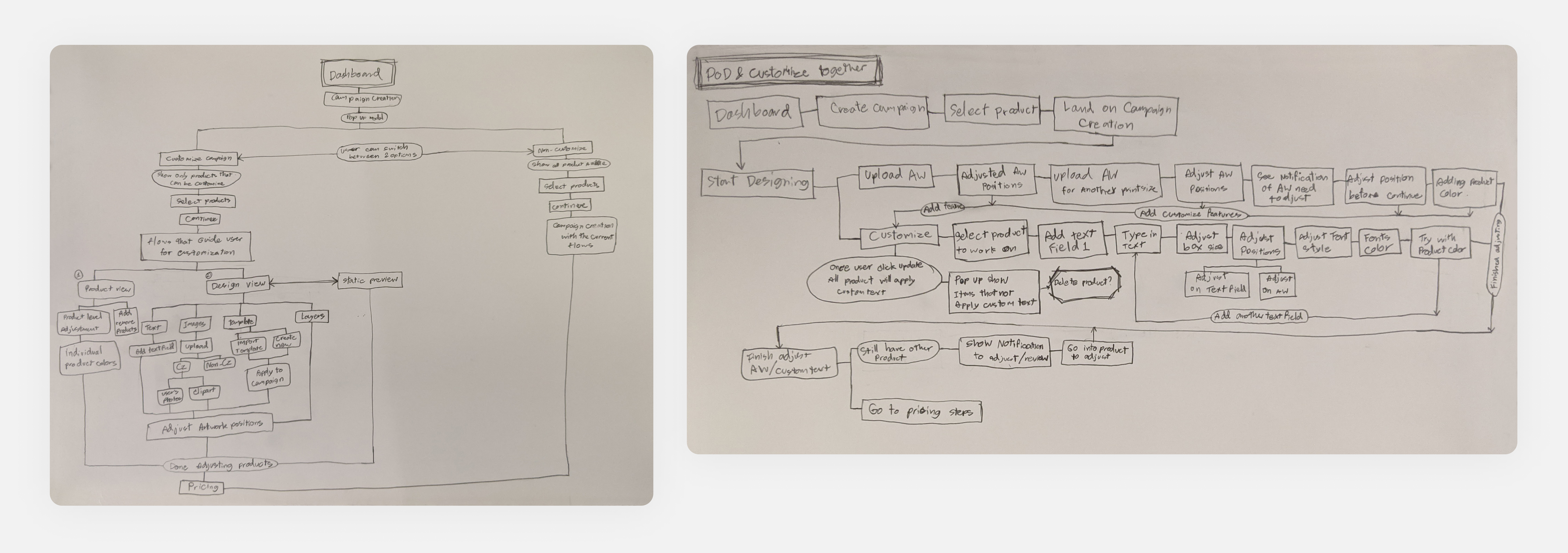
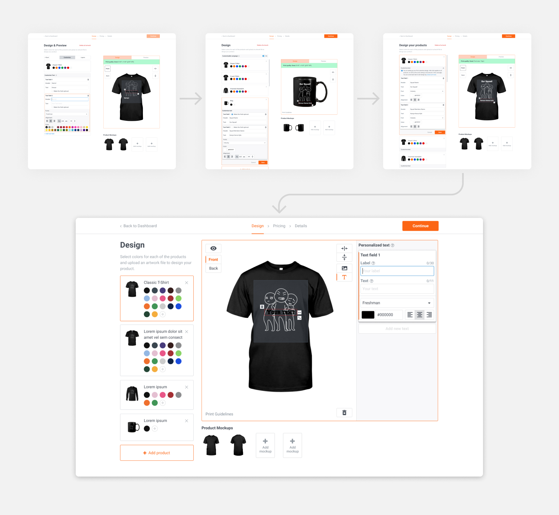
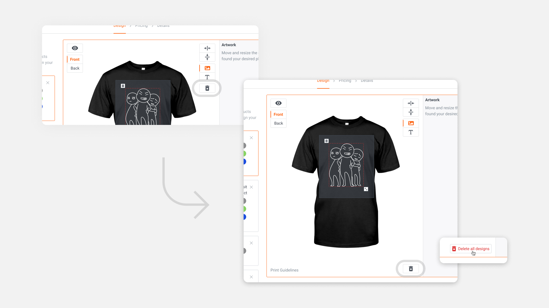
I worked on the seller side first, as it is the most complex part. We needed to consider fulfillment aspects, as we have a mix of in-house and 3rd parties to produce customization products seamlessly. We ensured product mockups on the back end match designs that the merchant created, to show buyers a preview that matches the final product that they will get as close as possible. I listed the user flow total of 26 use cases to predict potential edge cases that systems need to prevent.
Buy-side
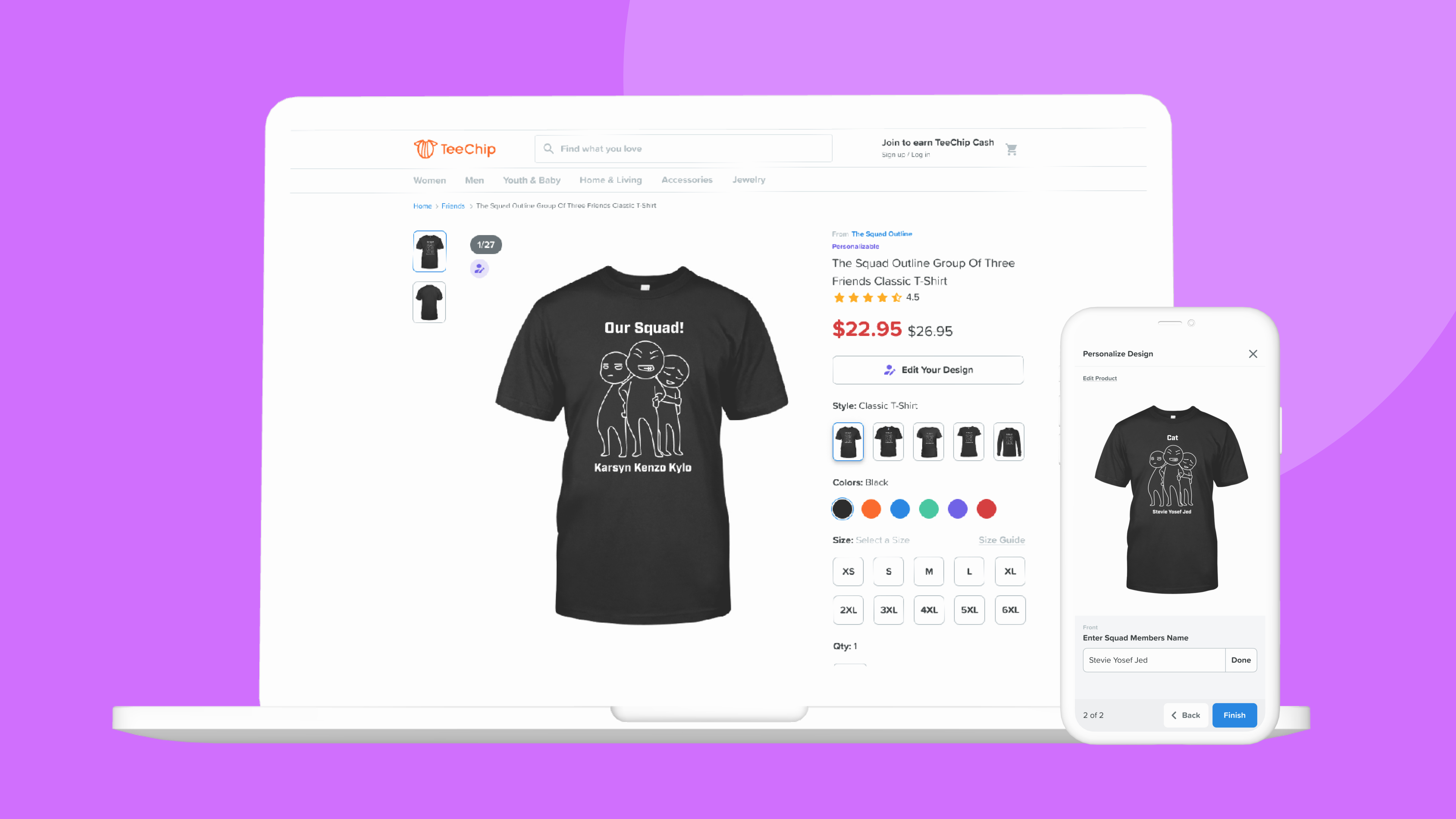
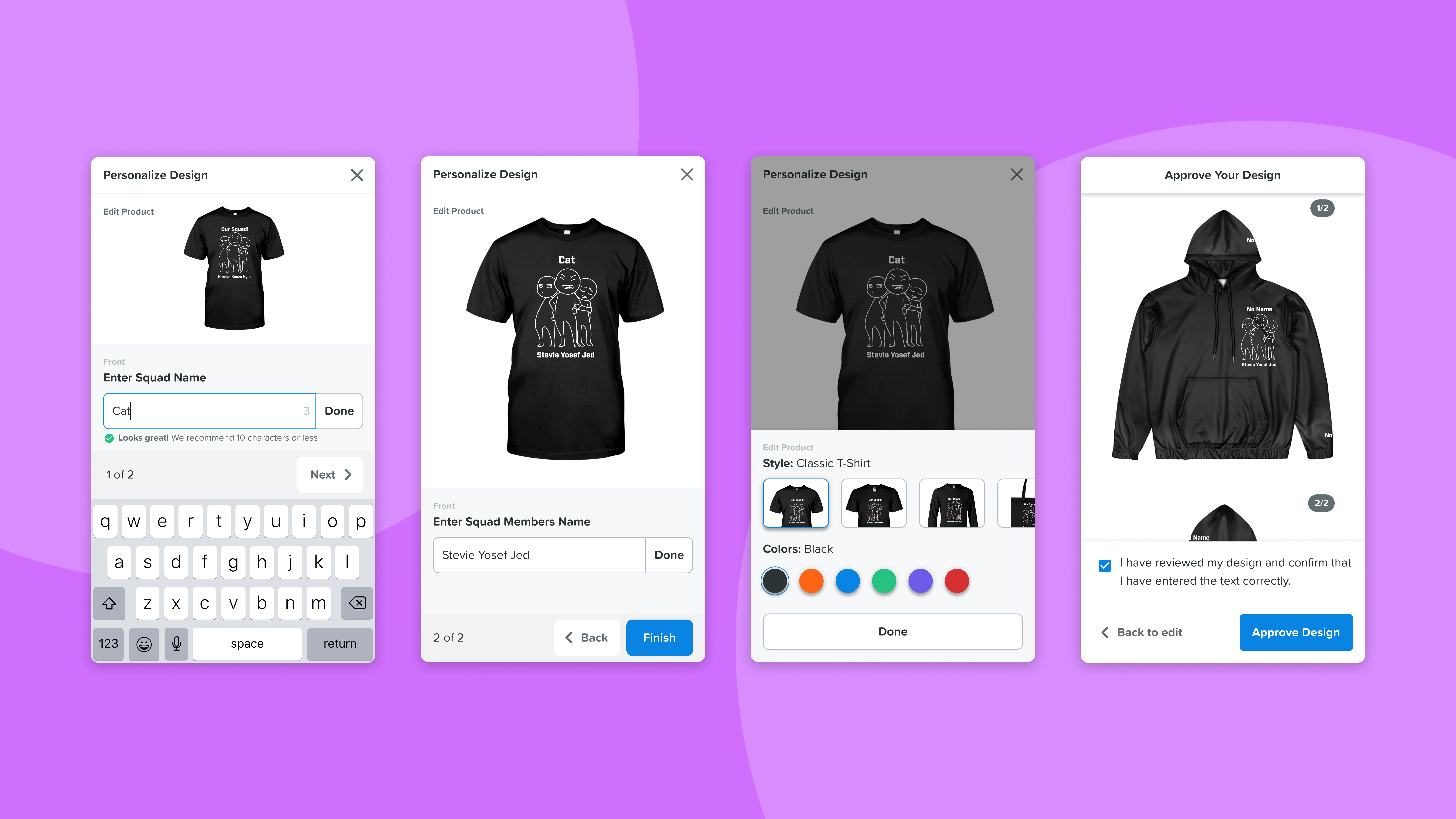
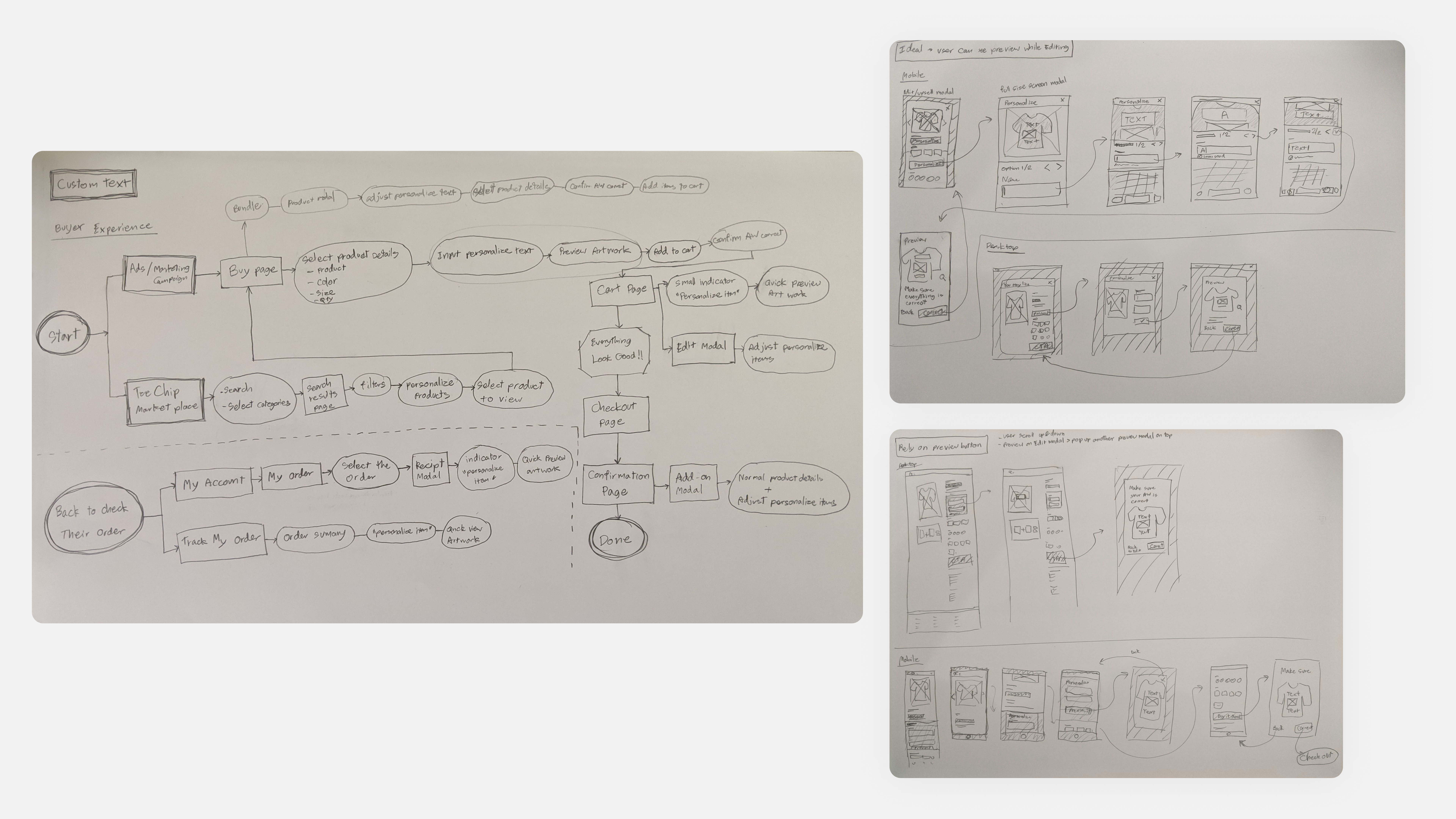
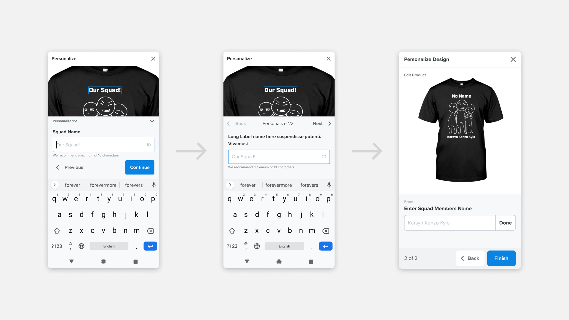
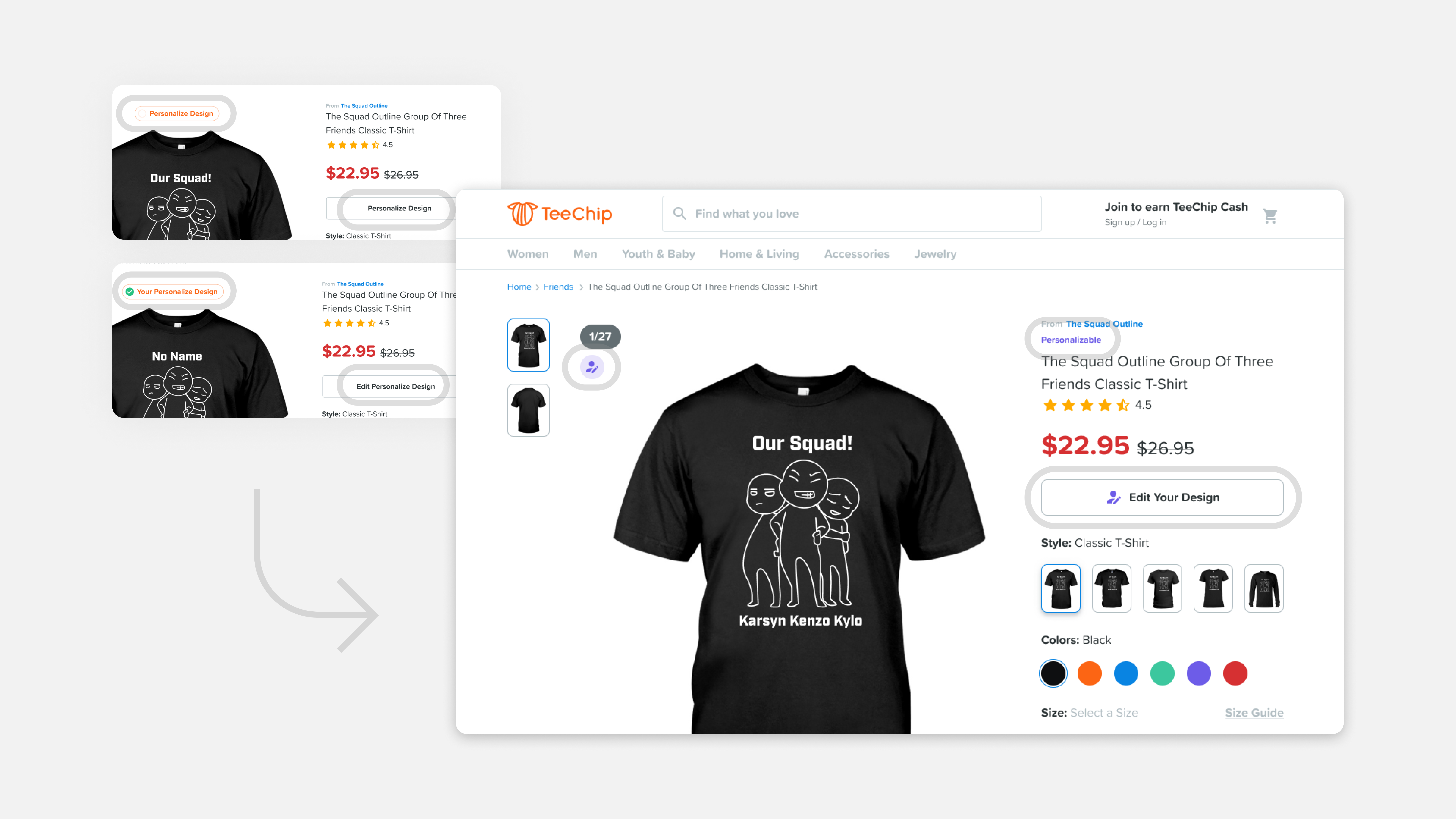
I researched our competitors, looking for inspiration, and then created a rough wireframe to discuss feasibility with the development team early on. Project managers wanted a way to disable features if they hurt conversion, so we built the experience in a modal. 70% of order purchases happen on mobile, so we targeted the mobile experience first, then desktop.
Usability testing
I planned usability testing, prepared clickable mocks, and then gave the materials to the seller support team to conduct testing in Vietnamese. We conducted usability testing with five high-performance sellers who also use personalization tools on other platforms.
Implementation
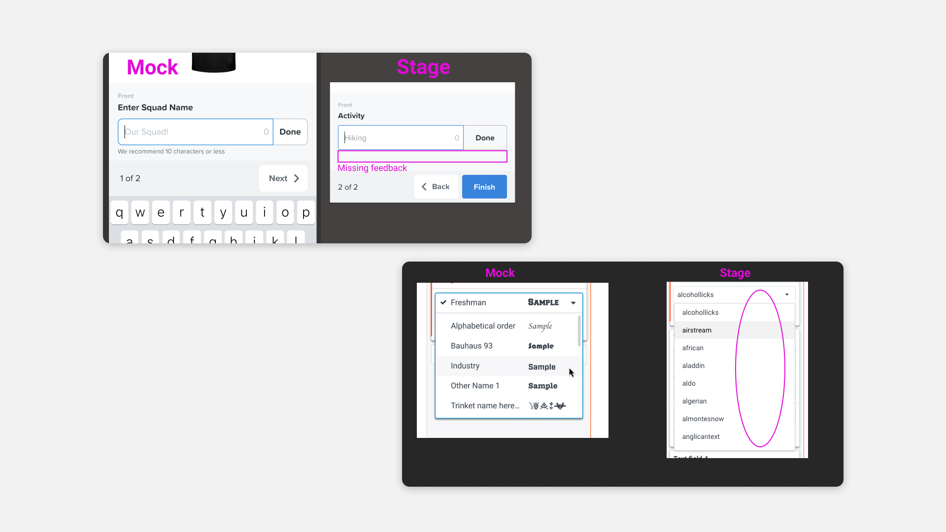
I worked closely with the engineering team to clarify any team concerns between our system and the design. I then worked on visual quality assurance to make sure the products were working well before launch.
Results
The personalized text feature is a high-performance feature.
- Personalize text items generate 10% of the total gross merchandise value.
- Generated $2 million in monthly revenue and increased conversion by 4% within 3 months.
